
WordPress, the world’s leading content management system, empowers millions of websites worldwide. While it provides a platform to have your website running, still, it is your responsibility to ensure that the site looks professional and engaging. One key element that can help you achieve this is by considering its color scheme.
Role of Color in WordPress Website Aesthetics
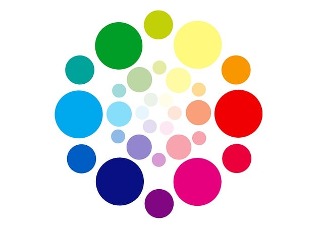
Color is not just about aesthetics; it’s about communication.
Here’s a brief overview of the role of color in website aesthetics:
- Branding: Your scheme should align with your brand. Consistency in color reinforces brand recognition.
- Emotion and Psychology: Colors evoke emotions. For instance, blue signifies trust and professionalism, while red can represent energy and urgency. Your color choices can influence how visitors feel about your website.
- User Experience: An effective scheme enhances readability and navigation. Legible text against a contrasting background ensures that your content is easily consumed.
Why use the Default Colors?
Many WordPress themes come with default color schemes and it provides great deal of advantage to users. For example, this allows them to maximize website’s efficiency. Believe it or not, default colors are pre-designed, making them a quick and convenient option for beginners or those with time constraints. Additionally, these colors are carefully chosen to maintain design consistency throughout your website.
Customizing Color Schemes in WordPress
To create a website that truly reflects your brand and vision, customizing your scheme is a wise choice. This can be done by carefully working on the theme customizer. Most WordPress themes offer a theme customizer tool that allows you to modify colors, fonts, and more. Then, there’s the CSS customization option that is more suitable for advanced users. CSS customization provides granular control over every aspect of your website’s appearance.
Color Scheme Best Practices
When customizing your scheme, consider the following best practices:
- Contrast: Ensure enough difference between text and background colors for readability.
- Consistency: Stick to a limited color palette to maintain a cohesive and professional look.
- Mobile-Friendly: Test your scheme on various devices to ensure its visually appealing and functional on all screens.
- Accessibility: Comply with accessibility guidelines to ensure your website is inclusive and user-friendly.
Stick to best practices, and you’ll be well on your way to making a memorable online presence.


